Monday, 26 January 2015

Evaluation Question 3

What kind of media institution might distribute your media product and why?

After going through all the institutions, I have found that Bauer and Mark Allen Group Business and leisure are  potential institutions for my media product.
  First of all, Bauer are a huge media company who have a wide variety of magazines who could potentially be looking for new projects which could potentially develop a large fan-base. The one problem with this idea is that Bauer are absolutely huge with a large portfolio of magazine franchises. This could cause the institution to not want to take on a new franchise as they already have a number of established franchises.


My other Institution in which I am going to do is Mark Allen Group (or MAG). I have chosen these as they are the the company who produce JazzWise. This is significant because JazzWise is the top selling Jazz magazine for the UK, which is where my Target Audience are from. Therefore, if I used MAG, they already have a following of people who are into the JazzWise magazine who cold have a look at this magazine. One issue with this is the idea that they won't take my products on board. The main reason as to why they wouldn't is because they already have an established Jazz magazine which is very successful so they may see it as a waste of time.

Overall, I believe that Mark Allen group will be the best institution for me to approach with my magazine. This is because Bauer already have a massive portfolio of magazines, which gives me a lot of competition to be a successful magazine compared to the Bauer magazines. Also, Mark Allen group already has a jazz magazine, even though their magazine is aimed at an older audience. This would compliment my magazine well as between them both, w can cover a wide age range when it comes to the target audience.

Monday, 19 January 2015

Evaluation Question 4+5

"The age of my target audience is 16 to 25. I can keep to this by using bright colours in certain areas to get their attention."
I was able to meet this criteria, during the making of the magazines, I was able to implement part of this by making the magazine bright for the younger audience. personally, i thought it worked as it separated my magazine from the rest, due to it being bright, therefore braking a convention.

"I would also make sure that the magazine is unisex. This so that I have the biggest target audience as possible. If my target audience is diverse enough that gives the magazine enough of a chance to get sold."
I was able to meet this as I allowed my text to be varied for both sexes. The photos I used had both female and male models in which gave the male gaze and the female gaze to the target audience.

"I would try and make sure that people with different lifestyles; including those with long working hours, unemployed or people who have only got a weak education. If I can implement enough diversity into my magazine, this magazine will be great for anyone who likes Jazz" 
I was able to meet this criteria as the point for people who had a weak education was still able to read the magazine due my inclusion of simplistic language. To a certain extent, this did work as it allowed a wide range of people to be able to read the magazine, but one issue in which I created with this idea is that professionals and much more dedicated character in the Jazz industry might be less inclined to read as the language would have thought it was too primitive for them.

"Things in which I have to be cautious about though are making sure that nothing which is subjective or offensive to any religion or social group is used."
I met this this criteria as the content I included was not offensive in any shape or form. This is because no discrimination, racism or promotion or negativity had been implemented into my work. 

Wednesday, 31 December 2014

My Page Drafts

While I was creating my pages, I made sure that I mainly stuck to a rough draft so that I know what I need to put on each page and where everything needs to go.
This was my front cover draft. I kept to the draft reasonably well with the only alterations being to the colour scheme and the addition of an extra box on the right hand side for promotion of various parts of the magazine.
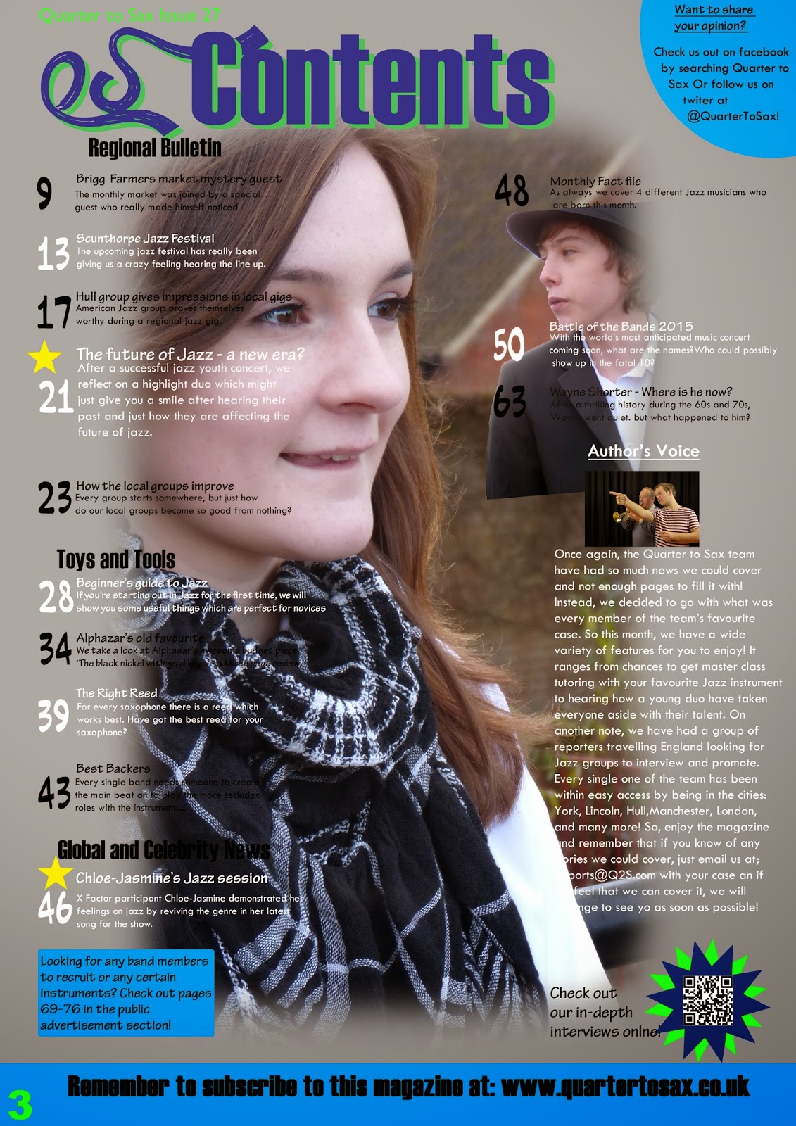
This is my Contents Page draft. After looking at my research, I decided on a double page contents due to the ability to include more content and to also give me more space to improve it's appeal to the eye.
Apart from a few alteration I kept to the draft really well. I included both highlighted and non-highlighted topocs andalso substituted the competiton on the left page for author's notes. I also added an area to subscribe to the magazine and which has sponsors as well.
This is my DPS draft. Surprisingly, I kept to the draft so well that only one alteration was made. The alteration was made to try and improve the flow of the whole page text, which it did very well. This was to add two quotes below the main image in the centre of the page. This broke up the text and made it flow better when people were reading it. I did not include a colour scheme for this page because I felt that the colour schemes from the other pages would just flow through to this one. After some careful work, I made this a reality.

When thinking how my drafts were useful to me, I took into account just how many alterations were made and how alike the pages both look. I also look into the idea of both the draft and product having a flow between them. This includes the draft having a basic feel, which is then improved once the real thing is finished. Overall, I feel like my drafts played a vital role in creating my pages. This is because the drafts are all basic plans which are can be classed as unfinished to a professional standard. These were then improved during the design stage, but still hold the basic form of the draft. Telling me that the drafts were good enough for me to work with.

Wednesday, 17 December 2014

TA Analysis

My target audience are young, diverse, multi-cultured teenagers of both sexes. To make sure that I appeal to the group, I will make sure that I look into representation. To do this, I will make sure that I use multi-media platforms, rather than just printed media. I will include websites, downloads and QR codes as well. The reasoning behind this is due to my group being young. They will not like it if they can only sit down and read, because they will get bored very quickly. Using these different media platforms allows the audience to change platform if they get bored.
I will also remember to use stereotypes to a certain extent. This is because although my target group will likely want to think, they will not want to sit and put a huge amount of thought into one thing. Doing this will put them off the magazine. Stereotypes I will keep include the young Jazz player. They will either wear a suit or a dress. An older player will still be formal but will not wear a suit. So I will be breaking the stereotype of older Jazz players.
One thing I have to remember is what Perkins said about stereotypes,"Stereotypes are not simple." When he says this, he means that stereotypes on a whole are very complex profiles given to a group of people used to collect them all together. For to break this in some aspects could cause people to portray as a different character altogether. One example of a stereotype is that all Rappers are African-American and are very hostile people.
The text I will create will also be as informative as possible. I understand the groups paying to be entertained, so although I will stay informative, I may exaggerate an odd thing here or there, this will make sure that the text is still entertaining while being informative.

Target Audience

While designing my pages, I have been showing a control group of jazz fans of my age my work as it progresses. They then tell me their verdict on these pages and eventually brought me to a conclusion on the TA. The age of my target audience is 16 to 25. I can keep to this by using bright colours in certain areas to get their attention. I would also make sure that the magazine is unisex. This so that I have the biggest target audience as possible. If my target audience is diverse enough that gives the magazine enough of a chance to get sold. I would try and make sure that people with different lifestyles; including those with long working hours, unemployed or people who have only got a weak education. If I can implement enough diversity into my magazine, this magazine will be great for anyone who likes Jazz. Things in which I have to be cautious about though are making sure that nothing which is subjective or offensive to any religion or social group is used. As long as I keep to this, I should be fine!

Monday, 8 December 2014

Front cover page so far

After working for so long I have completed the layout for my music magazine front cover. I have done this from my plan in which I have and will post in the future.
I have chosen the blue transparent banners because the background makes it very difficult to actually annotate to a certain extent. I then decided to add the blue banners, but they were too sharp and were drawing attention away from the photo. As a result I decided to make them transparent. This causes them to make it easier to type over the background but the banner isn't too sharp. The cover story at the bottom was able to stay opaque because the colour isn't bright enough to drag attention away. It would have looked weird as well if the photo involved with it was transparent so I kept that opaque and it works very well.

Friday, 5 December 2014

Props used in Photoshoots.

To stay as minimalistic as possible when it comes to props, I have limited myself to three Jazz related props and one general prop.
The three Jazz props I have used are a cornet, a trumpet and a fedora. I have chsoen these as my desired props for multiple reasons, the cornet and the trumpet were chosen due to them being a hugely popular instrument in the Jazz industry. The cornet and saxophone are also used as symbolism of the industry because of their popularity. I have chosen the fedora due to it being part of the stereotype of a male or a female jazz player. Alot of jazz players did wear headwear like a flat cap or a fedora, so if I were to use a fedora it really bring that across. Fedoras are also linked to the prohibition perriod during the 1920s and early 1930s. With this being around the same time as the birth and spring in popularity of jazz, it seems appropriate to use fedoras to show their value.

I then decided on a chair to be my general prop. This was because using a chair I could get some interesting shots of my model. One in which being of her looking at the camera, facing the camera, while she is sitting on the chair backwards. Little subtle things like this can improve photos by a considerable amount so I decided to use a chair to take these shots and get the best I possibly could.

Reviewing my Third photo shoot

This was going to possibly be the final photo shoot as I have finally got a photo collection which is worthy of being on the front cover.This is a huge step in my coursework because it means that although I have been working b establishing the layout of the pages, I can now add the photos and edit these photos to perfection.
The photo shoot went extremely well as I got photos of my models i the local town and I was able to include some local highlight buildings in the background. I was even able to get a photo shoot in one of the local traditional pubs, which is great because pubs are a significant place in the history of jazz.
Overall, I am happy with ow the photo shoot went and can now continue with my progress to the point where I can near finishing my magazine soon.
All the photos from the photo shoot are on this slidely

Monday, 1 December 2014

Third Photoshoot Plan

In two days, my third photo shoot will be taking place.
This one will e different to the others as this one will not be a studio shoot and will be inside the local town, Brigg. This is to add variation to my photos and to allow my models to be a little more natural. I will be going over some shots I already taken and applying a different environment to them to make sure that al my photos don't look the same.

I have 2 models for this shot, one male and one female. This is to add gender diversity and to create a blend which as two models because all my photos so far only had one model in, so I could improve some of the photos by having a second model in there.

Make up will be the same as the previous two, Foundation and red lipstick. Nothing which has a big impact on the model's face as I want to try and keep the faces as natural as possible. This adds to the character of the photos I believe.

Costumes are very similar as to the other ones I have done. My male model will be wearing a White shirt with Black formal trousers and a black fedora, this is to give him the smart but slightly casual touch in which I feel jazz is. My female model will be wearing White 3/4sleeve shirt and skinny trousers with a black scarf. This is to give her the same colour scheme as the male model but to also show the difference in the two genders when it comes to dressing for the genre. Also white and black are both different shades of the grey which is meant to be a main colour in the house style.

Reviewing My Second photo shoot

After taking some new photos of differing poses and multiple shot styles.

Due to the success of this photo shoot, I have been able to get this model to do another photo shoot with me in the future. We were able to take photos with included Dynamic shots, over the shoulder shots, casual shots, and many others! Hopefully, this will allow me to be able to use these as contents and DPS Photos which could be used as the main photos instead of side photos.


Creating my Contents page

After spending about 5-6 hours on this page I feel I have finished my Contents page at last. I decided to do my contents page first as this was the main one which could be done with the least time involved in it as not too much skill is needed compared to the other pages which includes a high photoshop skill for the Front Cover and a high English skill for the Double Page spread.


I chose the grey background as the house style includes blue and grey. The reason I did this is because blue is a very youthful colour with the grey bringing in age to merge the youth and the age together of the jazz genre.


I have left a black space because I will be putting an image there with some text as an extra contents area. If I can make it what I want to make it, it will be a competition and the only other alterations will be the word topic to be changed to actual topics. 'No' will be changed to page numbers. The 3 big blue boxes will be getting images inserted into them so that the featured topics have a little information added to them.

Friday, 21 November 2014

Alterations to Masthead

After some Target Audience research, I have found out that my masthead wasn't the best and had to change it. My new masthead will be called 'Quarter to Sax'. I chose this because I retook  a survey I made and found that Quarter to Sax was a popular favourite. This choice was also good because was almost the same letter count as the previous choice of masthead which is  not going to alter the magazine too much.

Wednesday, 19 November 2014

Evaluation of progress so far.

After all the work I have done for my Jazz magazine, I have evaluated what I have done and what I haven't yet.

Content which is of satisfaction but could be improved once all work is done includes;
  • General Research
  • Front cover research
  • Contents page research
  • DPS research
  • Actors and models
My Presentation has been good and Time management has been quite good as well.

Work which has to be completed now includes;
  • Potential TA has not been looked at.
  • TA Analysis has not been monitored
  • Costume and make up
  • Props
  • Layouts/drafts of pages have not had a post yet.
The first part in which I will focus on will be TA analysis and profile. This is because the TA are very important and if I cannot have a TA profile I won't be able to attract customers and readers.

Costume, make up and Props will be done after because they are already done and just need typing up. They will be done afterwards because the TA research might change what I do.

Friday, 14 November 2014

Costume/Make up

During my photo shoots I will make sure I use the perfect costume and appropriate make up.

Because my genre is Jazz, it would be good to have a variety of clothing but it would all be with a formality to it, suits are good for jazz but it can also be something as casual as a polo shirt and jeans or light dress. This is because they are reflects of the vintage times when jazz was at it's peak.

Make-up wise I don't want to use a lot of make up as I feel too much could damage the image of the model. I will use foundation and basic enhancement make up like lipstick and eye shadow. This is so it enhances the facial features without making them too artificial.

After the first photo shoot

During the first shoot it was quite fun and really discovered a few ways in which I can help others in multiple ways. I was able to get to grips with the basics of helping direct where people where meant to be. After photography was done with my male model, I moved on to et photos with my female model.


Before I took photos of my female model, I was assisting other people around in the shoot. One group needed props and costumes being sorted for them. I was able to help them with them and help them decide how to pose. After all this was done, I found my female model was ready to take the photos. We took roughly around 35 photos today to see what we can choose. A lot had no problems with, but there will definitely be the one where I will need to consider not using due to level of quality. Personally, I believe today's photo shoot was successful.

I was able to get all my photos onto a slidely to display click here to see the slidely

Organisation of models

For the first photo shoot, I have two different models. These models are complete opposites and will e interesting to use as each will represent the idea of the jazz genre not being dead.

One is an elderly male which has history in the jazz industry, he is god as in the DPS  will be needing to reference a professional jazz musician to help with the subject I will be doing.

The other is a 16 year old female which will show that there is a chance for the genre to be revived to the youth.

Other models which are a possibility for future photo shoots are another 16 year old female and possibly a few 16 and 17 year old males. These will demonstrate the amount of people who really get involved into the genre of jazz.

Organisation of Equipment

The equipment I will need for the upcoming photo shoot include cameras and soft boxes.

I was able to get hold of two different cameras in which I will use for varying quality and different photo styles.

One is the Nikon D7000 which is a high quality camera. Better for the action and shots and more complicated shot which are out there. With this i will use a Prime 35mm lens. I will use this lens because it will give me high quality but also so I don't have to control the zoom and i can just move around for that.

The other camera is a LUMIX DMC FZ62. This are middle to entry level tier cameras which are good for basic images due to the basic nature of this camera. I will also use a UV 25mm lens.

Photo shoot plan 1

This past week I planned to do a photo shoot on friday 14th November 2014.

This photo shot would include two models. An elderly Male which was previously and still is a member of a jazz band. I also have a 16 year old female friend of mine to do the opposite sex.

The location of my photo shoot would be the drama studio as there are many things I could do to interact with the model in the studio. I also believe that the drama studio would be better because I will be able to get multiple lighting affects involved as well.

The costume in which would take is different for each model.
I have a traditional and almost vintage Jumper suit which is in a green style colour for the male model. this is good as since the model is of an older age it will reflect his elderhood and portray him as being from the older generation of jazz players. the costume I have for the female model is a fitted black dress with a black fedora. This is good as it takes inspiration from the older fashion for jazz musicians of the female gender from the time. It also has a modern twist with the dress being fitted. I believe this will be good as darker colours showed the class of jazz players, so since it is black, it can't get much darker.

The props I will be using are a trumpet and a saxophone. the trumpet will be for the male model and the saxophone will be for the female model. This is done so that each model will be linked to the jazz genre if you exclude their clothing. I believe that i will also e able to get some action shots with these props if I can which will look good as well!

Any make-up which will be used include foundation and red lipstick on the female model as it will help enhance the model making them look more photo friendly.


Friday, 7 November 2014

Icons and symbolism

There are multiple icons in the jazz genre in which I can implement:

The saxophone - a classic instrument which if seen automatically links to jazz, this could be implemented into images or as a small image near the edge of the page. It could be used as a pug.

Smokey room - This is a vintage and traditional environment in which jazz was usually done in. This would back in the 1920s and 30s to demonstrate at the golden age between WWI and WWII before the Wall Street Crash. This could be implemented as an effect in images or on the front cover.

Suits - Traditional jazz players wore suits to look their best, also as that was the fashion back in the prime of the jazz genre. This could implemented as a costume easily.

Cultures - The African-American culture was the main culture to kickstart the jazz genre. So holds a special place in Jazz history. This would be more difficult to implement, but is possible in the way of models being of an African-American origin.

These are some of the more common icons in jazz and are the most likely for me to try and include in the making of my magazine.